@DittoLiv raised $45M Series A round

@DittoLiv raised $45M Series A round
@DittoLiv raised $45M Series A round
// Case study / The 5 Types of Wealth
// Case study / The 5 Types of Wealth
// Case study / The 5 Types of Wealth
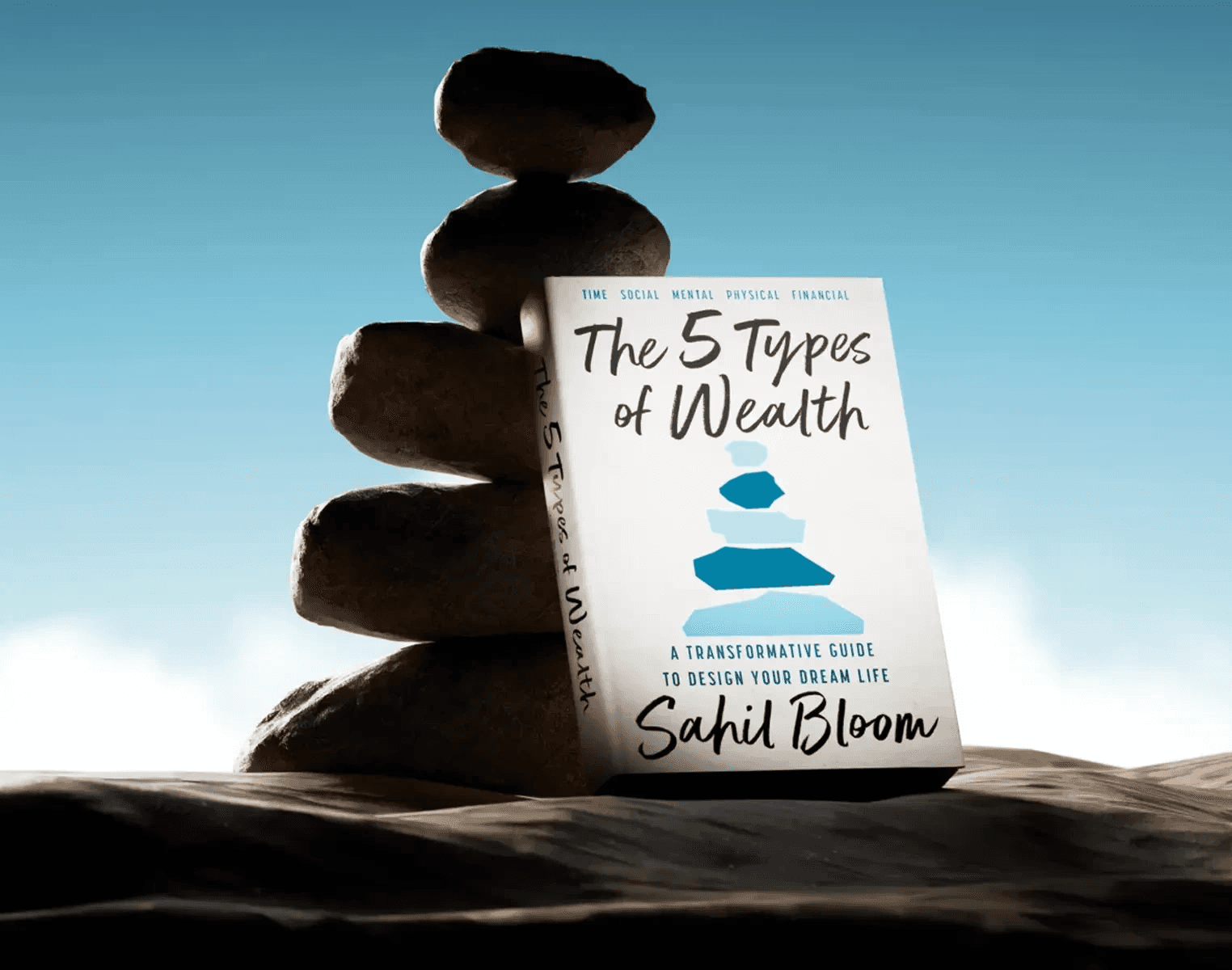
High-Converting Landing Page & Cover Design for Sahil Bloom's NY Times Bestseller,
The 5 Types of Wealth
High-Converting Landing Page & Cover Design for Sahil Bloom's NY Times Bestseller, The 5 Types of Wealth
High-Converting Landing Page & Cover Design for Sahil Bloom's NY Times Bestseller, The 5 Types of Wealth

Our team had the privilege of designing and developing the official landing page for Sahil Bloom's New York Times Bestseller, "The 5 Types of Wealth," which launched in February 2025.
Our team had the privilege of designing and developing the official landing page for Sahil Bloom's New York Times Bestseller, "The 5 Types of Wealth," which launched in February 2025.
Our team had the privilege of designing and developing the official landing page for Sahil Bloom's New York Times Bestseller, "The 5 Types of Wealth," which launched in February 2025.
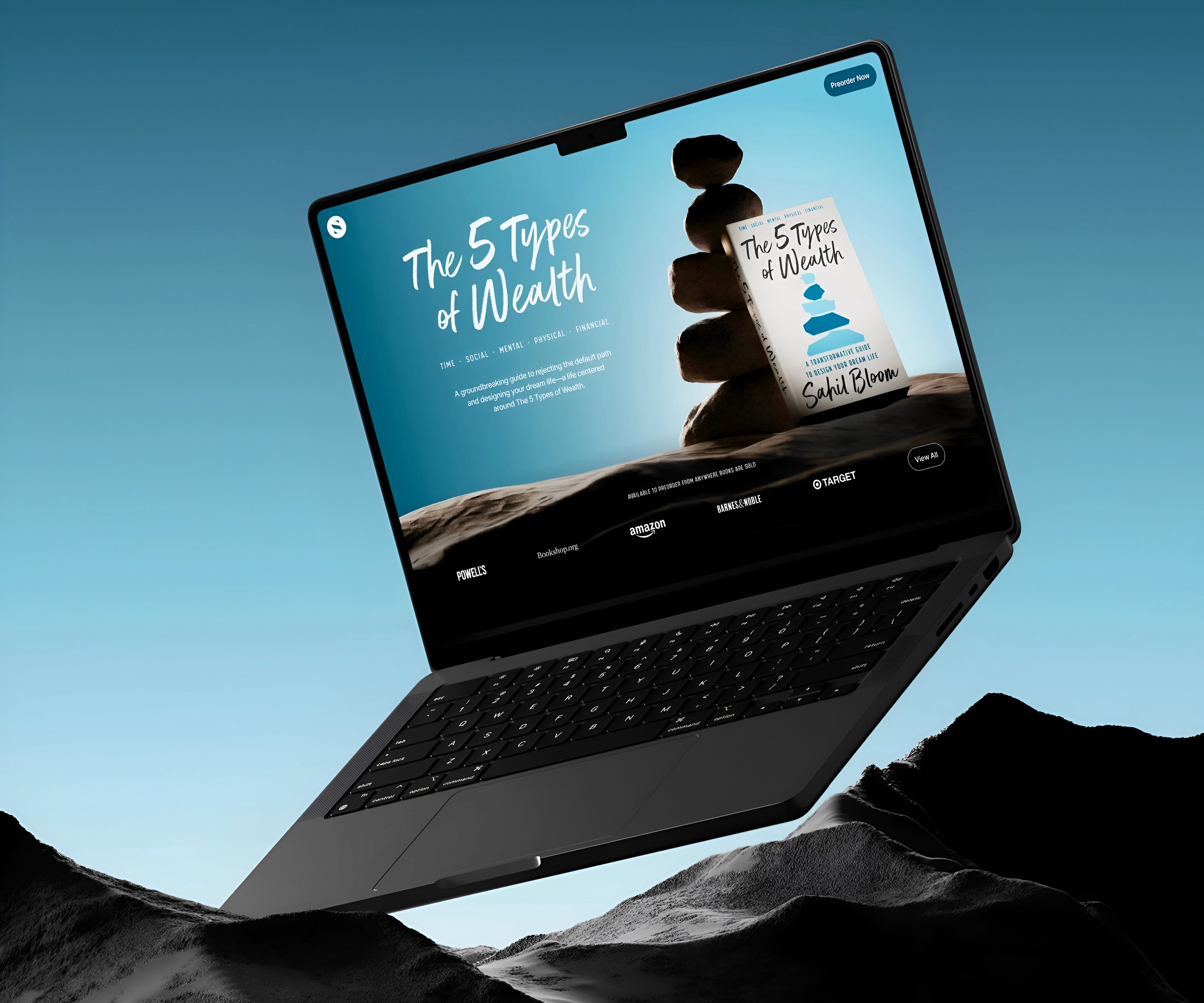
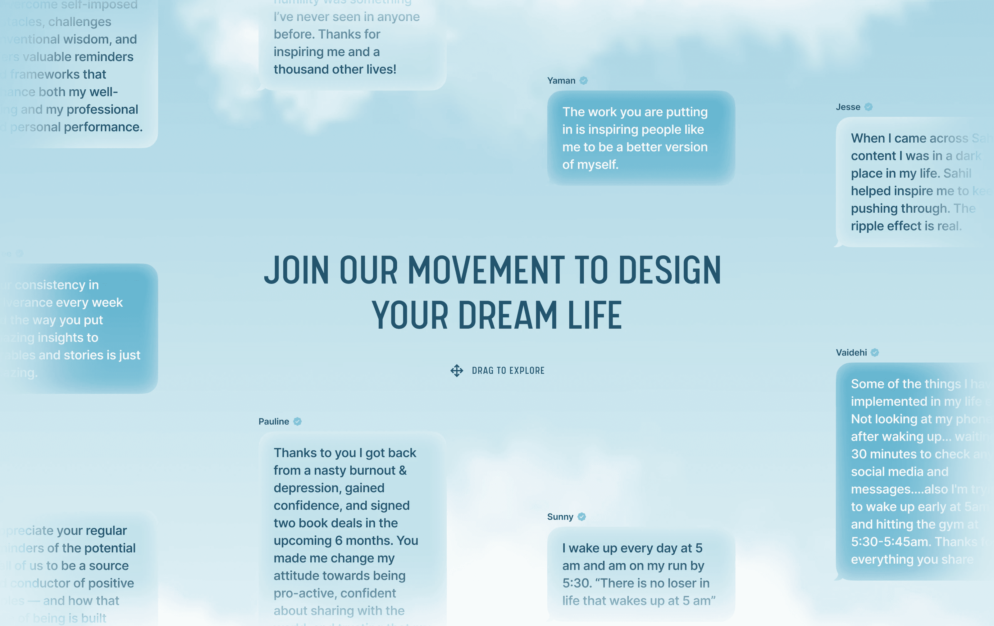
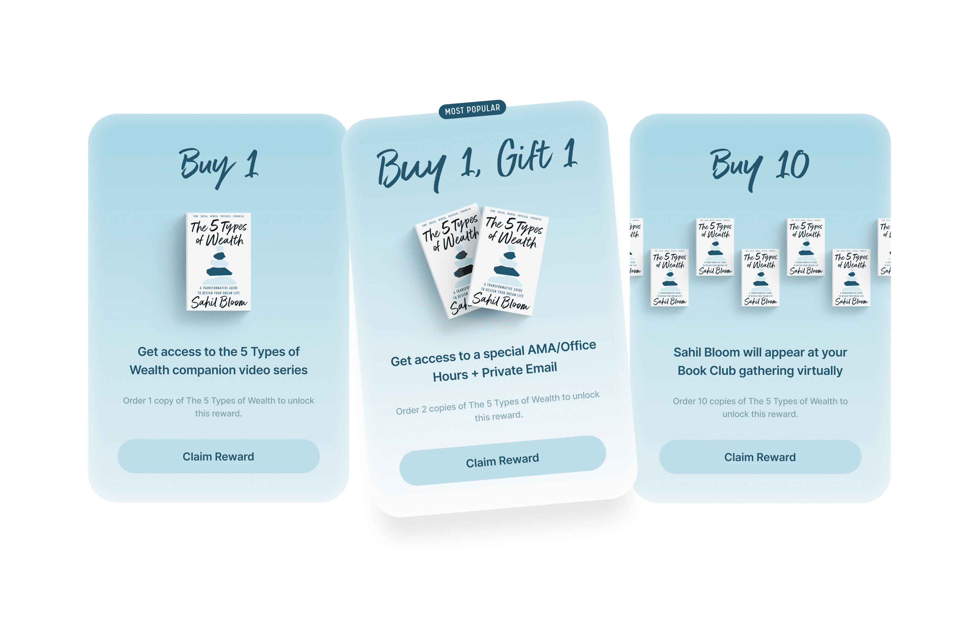
The comprehensive digital strategy we implemented drove exceptional pre-sale performance, significantly contributing to the book's successful launch. Beyond the digital space, we extended our creative vision to a cohesive suite of print materials and marketing collateral that strengthened the book's brand identity across multiple touchpoints.
Our integrated approach to this campaign demonstrates our ability to craft compelling digital experiences that translate into measurable results while maintaining brand consistency across both digital and physical mediums.
Brand Positioning
Brand Positioning
Brand Positioning
With most resources out there too medical, geared towards kids or focused on "fixing" divergencies, Divergently is challenging the conversation and building a safety net community.
We anchored the brand with an engaged, wise and proactive personality that empowers without being preachy.
Divergently feels energetic because it’s mission is nothing less than propelling the neurodivergent community forward.
Web Design
Web Design
Web Design
Styling the digital safety net that Divergently provides for the neurodiversity community needed to feel secure and inviting.The website makes use of core branding themes while staying straight forward and easy to navigate.
Styling the digital safety net that Divergently provides for the neurodiversity community needed to feel secure and inviting.The website makes use of core branding themes while staying straight forward and easy to navigate.
Styling the digital safety net that Divergently provides for the neurodiversity community needed to feel secure and inviting.The website makes use of core branding themes while staying straight forward and easy to navigate.
Visual Identity
Visual Identity
Visual Identity
Catering to the neurodiverse consumer was paramount in creating the brand identity. Using an approachable sans-serif type to set the logotype and leaning into off-kilter lettering gives the brand a unique twist.
Research shows that neurodivergent users prefer high contrast colors for increased accessibility. At the same time they experience cognitive fatigue with very harsh colors. Using a dark plum color instead of black and pairing it with off-white grey tone will make content more digestible.
Bright gradients create an uplifting environment and provided further contrast, while signaling that this brand is here to change the narrative for the positive.
// LET'S get started
Start your new project with Donefast today!
Traditional Agencies
$12k+
Starting at $3995
x you?
Book a 30-min Intro Call and take a guided tour on how we can help you.

OR SIMPLY

Chat Right Now


One Central, WTC
WeWork 2nd floor, Eldeco Centre, Block A,
Malviya Nagar, New Delhi, Delhi 110017
Follow us on X-
// LET'S get started
Start your new project with Donefast today!
Traditional Agencies
$12k+
Starting at $3995
x you?
Book a 30-min Intro Call and take a guided tour on how we can help you.
OR SIMPLY
Chat Right Now
One Central, WTC
WeWork 2nd floor, Eldeco Centre, Block A,
Malviya Nagar, New Delhi, Delhi 110017
Follow us on X-